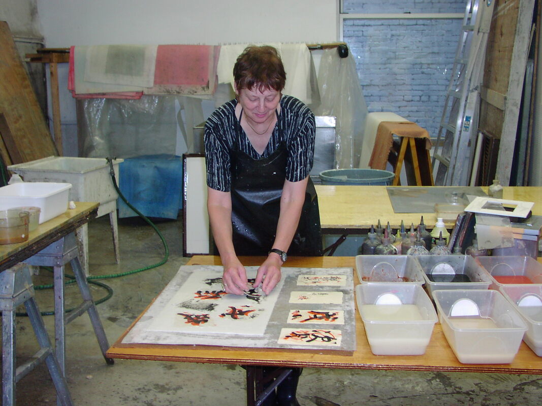
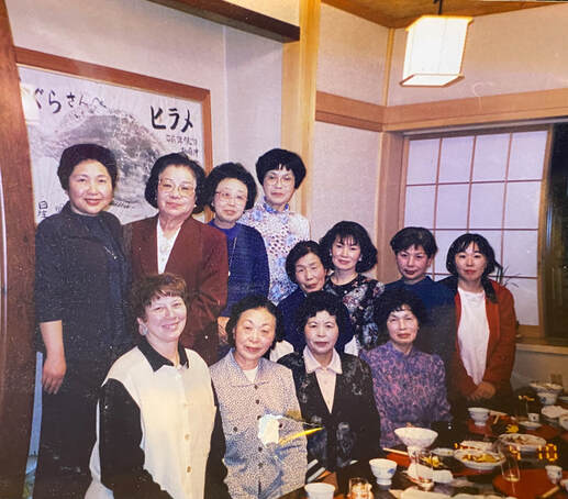
 First year of study, Rona with fellow students
How does an artist go to Japan never having studied Japanese and with the goal of finding a teacher, a “Sensei”?
In the mid 90’s I explored ways to realize a dream I’d had since college while studying ceramics and painting. After reading about, viewing, and being inspired by Japanese art, particularly calligraphy, in the superior collections of the Boston Museum of Fine Arts and the Metropolitan Museum of Art in New York, I wished to study calligraphy in Japan.
Though it took more than 35 years to realize my dream, in 1998, I spent the first of several years living northwest of Tokyo in the foothills of the Japanese Alps. It was not easy to find a teacher. But with help from one of her students, Kobayashi-sensei accepted me as her first and only foreign student. I started my studies with some trepidation since she spoke no English and my Japanese was almost non-existent.
On my first day in class, I was shown how to grind ink. The smell was divine. Given a beginner’s brush, when I made my first mark, tears came to my eyes. I was living my dream. And thus began a relationship that lasted for over twenty years.
My first challenge was to sit in “zazen”, upright with legs bent at the knees, the lower half of my legs touching my derriere and my feet curled up touching the floor. After a few minutes, my feet would fall asleep. I would have to change position and stretch out my feet under the low table. But I needed to sit properly to do calligraphy. It was a challenge I finally overcame through practice.
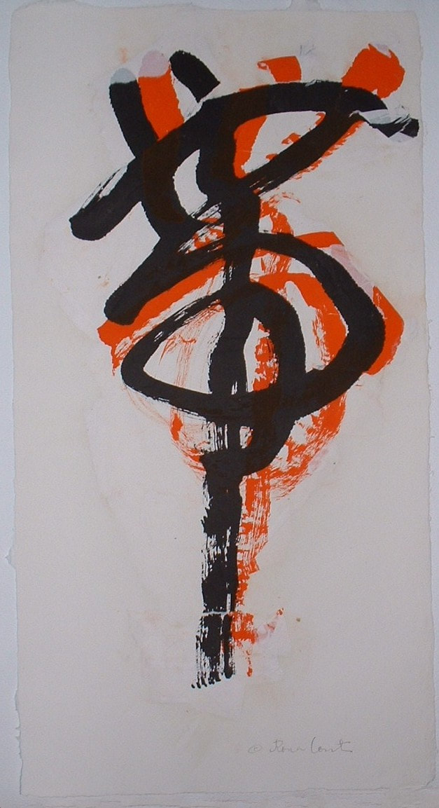
I was given a large sample to learn the basic strokes. Concurrently, I learned the numbers one, two, and three and the Japanese hiragana syllabary. Most important was the character which used each of the basic strokes copied from a large sample. The character means everlasting or eternal and embodies the eight different brush strokes one must learn to write.
I dedicated myself to long hours of practice in my apartment and went to class twice a week. I would show my practice work, then Kobayashi Sensei observed and corrected it in an orange-red ink used by instructors for precisely that purpose. I thought the contrast, the writing next to mine, was exquisite. Those red marks never felt like a mistake but rather like a collaboration of learning, my work next to Sensei’s corrections.
Who were my fellow students? All female, from the age of thirty to eighty, all of whom had studied for years with Sensei. Each student had her own assignment based upon her ability and rank, something I knew nothing about until the end of my first year of study.
The class ran for two hours. Then we would have “tea timu”. Each student would bring something to share without conferring about what to bring. Thus, we had tsukemono (pickled vegetables) alongside fruit and many sweets, my favorite.
I was learning Japanese along with calligraphy. I remember so many funny misunderstandings. Once there was talk of tabako (tobacco). I was mystified because they were talking about receiving that as a wedding gift. I said, “tabako?” Everyone laughed, a frequent occurrence. I smiled. They were talking about chabako, the large wooden container for tea implements, cups, and sometimes a teapot.
I often amused the students. Once someone brought to tea huge grapes. I ate one and could tell by the student’s expressions that I had committed some kind of gaffe. I ate the grape whole whereas they were peeling theirs. I had to explain the difference in grape size in the US and Japan, and that we ate grapes skin and all. They were surprised and puzzled.
Not understanding had some advantages. I do not know what I expected. I would not have been able to understand conversations about aesthetics, complex opinions of calligraphy matters. But they did not discuss that. Sometimes the talk was of shopping, like which was the best tofu shop. Though that was helpful, had I been with people in the US, such conversations would have bored me. I hate shopping unless it is for art materials, particularly calligraphy materials. The students were excited because a shopping mall was going to be built in Gunma-machi, a small country town surrounded by mountains on three sides. I was appalled. I loved my country living.
The students were puzzled and intrigued by me. They asked many questions which I could answer after learning rudimentary Japanese. They assumed I was accompanying my husband who was teaching English and were surprised when I said that I was not. I knew that divorce was uncommon in Japan at that time, but looked up the word just the same. They didn’t understand, thought I had made a mistake in Japanese.
“Go shujin wa?” (And your husband…), they asked.
I answered with “Imasen” (He isn’t here). That was true, but it made people think that he had passed away.
“Zannen,” (That’s unfortunate) they replied. No one ever mentioned him again, but their puzzlement increased. They could not imagine a single woman coming on her own to Japan to study calligraphy and for an extended period of time.
They were interested in my grown children, my daughter and son who were living in Boston and New York respectively. My daughter Sam and a friend, whose last name was Bucci, visited me. Sensei called my daughter Sam-chan and her friend Bucci-san. She gave them a calligraphy lesson. We were feted and so pleased to be invited to students’ houses for tea, lunch, or dinner. Later I was told that it was rare for Japanese to invite foreigners into their homes. Despite my initial lack of Japanese, and later with more ability, I developed close relationships with the other students and many Japanese who I met during my adventures.
All the while, I studied calligraphy with fervor. I advanced and was given more difficult assignments. In my apartment, I had a kotatsu (table with heating mechanism) for practicing hanshi (calligraphy sized about 8” x 11”). I had advanced to shinwayo, calligraphy that includes kana and kanji to write poems, haiku, and quotes. Sensei gave me the assignment to write the famous Matsuo Basho Frog haiku. The Japanese in the roman alphabet reads:
“Furu ike ya
kawazu tobikomu
mizu no oto”
Translated by D.T. Suzuki into English, it reads:
“Into the ancient pond
A frog jumps
Water’s sound!”
I practiced over and over again, never achieving a haiku to my satisfaction. I was learning how very difficult calligraphy could be. I would write three samples, then my legs would fall asleep. I would stumble up and start blaring Aretha Franklin’s “I will survive” thinking that I would never get out of that old pond. With my legs barely able to dance, I would twirl around knowing that I had to get back to that old pond. And so I did.
After a few months, I noticed that two students had shitajiki, felt mats for use under the paper so that the ink would not stain the surface and the paper would have a soft underlayer). The shitajiki had diamonds within squares to know better where to place their characters. I asked Sensei about them. Her response was, “You do not need them.” I was very pleased as they would have intimidated me instead of being helpful.
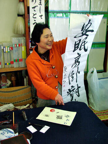 Sensei with Conti's first submission to the magazine.
Although I was uninterested in the ranking system within the calligraphy community, many students were interested as a way to show how much their skills had improved. Those students did scroll-sized work, which seemed beyond my ability. Yet at one lesson, Sensei gave me an otehon (sample) of scroll-size work with four characters. (photographs) I was excited to explore scroll-size work, named Jyofuku (35cm wide by 135 cm high), using Kanji characters, and as I surmised, it was easier for me than hanshi since I had done large, abstract paintings for about 30 years. I was used to organizing large spaces.
Sensei was full of surprises, and one was that she had a set of seals made with my name. They were for the scroll-sized paper and had my name not in katakana (syllabary used for foreign words), which I dislike because it is too angular, but rather in kanji, which Sensei had encouraged me to choose. Both the pronunciation and the meaning were taken into consideration in my choice. ‘Konterona’ consisted of ‘KON’ (Chinese reading) meaning soul or spirit, ‘TE’ (Japanese reading) meaning hand, and ‘RO’ (Chinese reading) meaning dew. My name’s final character was ‘NA,’ the first character in Nara, to represent my spiritual roots in Japan. I should add here that RO also refers to Russia and represents the roots of my maternal grandparents who were from Lithuania.
I had to learn how to apply the seal set using a waxy permanent paste which is red. It does not dry out if covered but does when used for a seal on paper. It is as permanent as the sumi ink used in calligraphy. The seal’s placement is crucial to a work, and it is up to the calligrapher to choose an appropriate seal. Eventually, a calligrapher has many different-sized seals with different scripts carved upon the stone and needs to choose which is most appropriate. The size and placement are chosen to balance and be compatible with the work. Calligraphy is the art of arranging white space. The seal signifies that the calligrapher’s work is finished to the satisfaction of the artist. It is the final part of the calligraphy and of critical importance.
One always hesitates when first learning to place a seal on a work. I hesitated greatly. One doesn’t want to ruin a work with a poorly placed or poorly registered seal. While not the best way to learn, Sensei placed the seal on my work the first time it was used. She also did not wish the work to be ruined because she had another surprise for me. She showed me a document with my name printed on it and other information I could not read. She read to me that she had formally enrolled me in the main school with the other students. I would be getting the monthly magazine and begin my quest for a ranking. And once again tears came to my eyes.
She had sealed the work as it was the first jyofuku work to be submitted for ranking. She also sent in the best of three kanji, kana, and shinwayo. One could do each of those categories in large or small size. Thus, there were six possibilities for entry each month. My assignments had grown enormously.
To be completely honest, I was very pleased but at the same time did not care about my rankings. But Sensei was a cheerleader for all. When the new magazine came out, the results were written for each person. It was not terribly difficult to increase one’s first attempts at “ranking up” as it was called. But the system was built to become more and more difficult.
I practiced diligently and joined the other students in exhibiting my work as one of Sensei’s students. In a few months, my visa would run out and I would have to go back to the States and apply for a cultural visa. I knew that I wished fervently to return to Japan. It turned out that the main school’s book was critical for me to continue my practice in the States until I was able to secure said visa.
All my calligraphy practice sheets, large and small, came back with me to the States. Customs pulled me over and the inspector opened my duffle bag, which was stuffed with the practice sheets. My heart dropped. I had so carefully arranged them so as not to get damaged. I tried explaining what they were and their importance, but the officer got bored and zipped up the case. I asked why my bag was singled out. The person said people sometimes bring in plant cuttings or drugs between flat sheets of paper. There were certainly plenty of flat sheets of paper but no drugs.
Because of reverse culture shock, it took a while to get my footing. Then my first booklet arrived from Sensei with samples for my assignments. I would do the calligraphy, choose the best ones (three of each assignment) and send them back to Sensei for ranking by the judges in the main school. Sometimes I would do between 20 and 40 practice sheets before choosing the best three. The selection process itself required detailed viewing to slowly remove the problematic ones.
I wondered how I could repurpose the stacks of practice papers in my studio, then one day it struck me. Before going to Japan, I had worked at a studio to do pulp painting. The process is quite complex. The artwork is made of paper pulp that is applied and layered collage-like in a myriad of ways to become embedded on one sheet of handmade paper. The finished artwork resembles a painting. While the process is direct and spontaneous, it requires a great deal of equipment and preparation before, during, and after creating the artwork, so artists wishing to work in this medium, must find one of the few existing special studios in which to create the work.
I envisioned an idea for a new series. I began by “editing” my practice sheets, which I tore into fragments, to make collages of the calligraphy before adding abstract shapes and lines with the paper pulp. The same principles for painting and calligraphy were applied. One had to balance the space and present interesting forms and mark-making to co-exist happily.
I came to this idea because of a past series I had created. Before going to Japan, I had been working primarily in paint and was introduced to the tactile and sensuous quality of paper pulp. I was enthralled with the compelling texture and light of the white handmade paper sheet, the glorious colors of the pulps, and the myriad of possibilities. But this new series would be quite different. Because I was using fragments of calligraphy, partial writings of haiku, Chinese and Japanese poems, and different styles, I knew that the calligraphy on my to-be-created artworks would be unreadable.
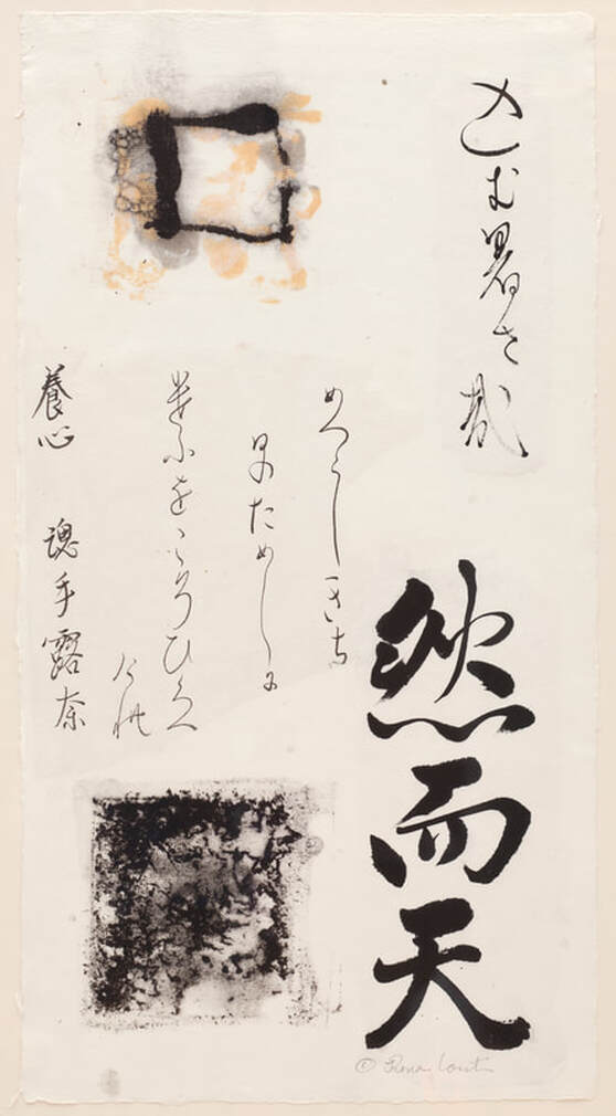
One pulp painting artwork, for example, titled “Heavenly Fields” perfectly illustrates the difficulty or rather the impossibility of reading the calligraphy. (Photograph) It also shows the various ways in which the pulp collages with the fragments. “Heavenly Fields” has three prominent Kanji characters, a fragment taken from a much larger poem. The characters are translated thus:
然 is a stative word after an adjective.
而 means "and" or "but".
天 means "heaven".
The other fragments can’t be read, even by my Sensei.
Many other works were created using fragments of calligraphy. Other works use fragments of my writing with Sensei’s correction alongside or upon the characters. These were called Collaborations.
With these explorations and calligraphy which can be read, I continue to study. I exhibit calligraphy as well as handmade paper pulp painting artwork. My explorations are, for me, the perfect marriage between calligraphy and pulp painting in handmade paper.
Rona Conti is a pulp painter and calligrapher whose artwork is represented in numerous public, private and corporate collections and museums in the United States and internationally. In 1999, she began studying Japanese calligraphy with (Mieko) Kobayashi Sensei of Gunma, from whom she received her pen name (魂手恵奈). Invited to exhibit calligraphy at the Tokyo Metropolitan Museum of Art with the International Association of Calligraphers for the last five years, she received the “Work of Excellence" Prize three times. She was invited to demonstrate Japanese Calligraphy at the Boston Museum of Fine Arts in 2009.
Photos accompanying this article provided by Rona Conti.
Photos accompanying this article provided by Rona Conti.
Use and/or duplication of any content on White Enso is strictly prohibited without express and written permission from the author and/or owner.
Proudly powered by Weebly
